Indifference Curves
Course Outline
Indifference Curves
Think about what restricts your choices when it comes to buying goods and services. Your income is one variable. Prices are another. What about what you like and don’t like? That’s an important one!
Your preferences play a huge role in how you decide to spend your money. We often face so many options when it comes to what we buy that it can be difficult to decide. Even with a simple example of pizzas and coffees, there can be many combinations that would give you the same level of satisfaction or happiness – what economists call utility. There are also many combinations to which you might find yourself totally indifferent.
In this video, Arizona State University’s Professor Joana Girante will show you how to graph an indifference curve. She’ll also introduce you to marginal rates of substitution (don’t worry, it sounds more complicated than it is!). We’ll also take a look at how perfect substitutes and perfect complements change the shape of an indifference curve.
Teacher Resources
Related to this video


Related to this course
See all Teacher Resources related to this course
Transcript
As we make choices about what to buy, we're constrained by our own income and the prices of things. But our tastes or our preferences for what we like, or don't, are just as important. For simplicity's sake, let's stay in our two-good world, and look at how you might choose between pizzas and coffee. Suppose I asked you which of the following combinations you would rather have. This is like me asking you to rank them in order of preferences. Let's plot them on a graph.
On the x-axis we have the number of pizzas per week, and on the y-axis we have cups of coffee per week. Because we view pizza and coffee as good things, things that bring us utility, we always want more of them. Well, at least I do. Obviously, three pizzas and three cups of coffee are preferred to just two pizzas and two cups of coffee. Similarly, one pizza and one cup of coffee are less preferred to two pizzas and two cups of coffee. Consider this combination -- two pizzas and two cups of coffee.
In general, any combination in this region is preferred to the original combination. Think about why that is. Any point here represents a combination of pizza and coffee, such that you get more of at least one of them -- maybe even more of both. And having more of what brings us utility is better. Any combination of goods in this region, however, means you'll be getting less of at least one of the goods -- maybe even less of both -- and that will leave you worse off.
Now that we know what you prefer and what you don't prefer, let's think about the combinations of goods that will leave you indifferent. You may not mind if instead of having two pizzas and two cups of coffee, you have just one pizza and three cups of coffee. Or three pizzas and one cup of coffee. Any time someone asks you if you would rather have one combination of goods versus another, and you go, "Uh, I don't care," you are saying you are indifferent between the two. The line that connects the combinations that leave you indifferent is called your "indifference curve," and each point on the line represents the same amount of satisfaction, or utility.
Just like we drew the indifference curve for that first combination of goods -- two pizzas and two cups of coffee -- we could draw several other curves, each of which representing different levels of utility. This would be your indifference map.
Notice your indifference curve isn't a straight line. That's because its slope changes as you move between different combinations of goods. The slope of the indifference curve is called the "marginal rate of substitution," and it measures the rate at which you are willing to forego cups of coffee in order to get one more pizza, while keeping your utility constant.
The easiest non-calculus way to find the marginal rate of substitution at a given point on the indifference curve is to draw a straight line tangent to the curve at that point. For example, suppose you're considering this combination. Note it has very few pizzas and many cups of coffee. The marginal rate of substitution is four. This means that you are willing to forego four cups of coffee to consume one more pizza. As you move along the indifference curve and start consuming more pizza, your marginal rate of substitution falls. Why is that?
If you are thinking marginal utility, you nailed it! Each additional pizza you consume provides you with less utility than the previous one. But now remember, you are on an indifference curve, so maintaining your level of utility implies giving up one cup of coffee after another. But here's the thing -- as you are left with fewer and fewer cups of coffee, their marginal utility increases and the harder it is for you to give them up to get that additional pizza. Your marginal rate of substitution is two. This means that you were willing to give up two cups of coffee to consume one more pizza. That's two fewer cups of coffee than you were willing to give up when you had less pizza and more cups of coffee. It's because your willingness to give up cups of coffee decreases the more pizza you have that the marginal rate of substitution decreases along an indifference curve.
Most indifference curves look just like the one in our example. They are bowed inward. This is because the marginal rate of substitution changes depending on how much of the goods you have and your willingness to substitute between them. But there are exceptions, and indifference curves can look very different. Suppose you view two goods as substitutes. To me, that's juice. Maybe you too don't care if you drink orange juice or apple juice. In this case, you will be equally happy if you drink two glasses of orange juice and two of apple juice, or if you drink three glasses of orange juice and one of apple juice. Here your marginal rate of substitution is constant along your indifference curves, and is one.
Perfect complements are another extreme case. Suppose you're eating hot dogs. You want one hot dog bun for every hot dog. If I give you two hot dog buns but just one hot dog, you will not be better off, because you like your hot dogs with hot dog buns. In this case, your indifference curves will look like right angles.
Indifference curves come in many shapes and sizes, but they do have a few things in common. When we talk about goods, the first thing you note is that indifference curves slope downward. Why? Because the only way for us to keep utility constant when consuming more of one good is by consuming less of the other. We also assume that more is better. That means that indifference curves that are farther away from the origin -- I mean are farther to the right -- represent higher levels of utility. However, if we're talking about bads -- say, pollution, or trash -- then the less we have of them, the better. In this case, we are better off when we get closer to the origin.
Another important property of indifference curves is that they cannot intersect each other. This makes sense. If we allow two indifference curves to cross, we are saying that the combination of goods at the intersection point represents, at the same time, different levels of utility. This makes no sense. Economists don't like things that don't make sense, so we assume this cannot happen, despite people being different and exhibiting different preferences towards goods.
While preferences are solely about our tastes and dreams, our actual decisions require us to get reality into the picture. We do that when we make our decisions constrained, by our income and the prices the market invisibly determines. We look at that next.
Subtitles
- English
- Spanish
- Chinese
- Hindi
- French
- Arabic
Thanks to our awesome community of subtitle contributors, individual videos in this course might have additional languages. More info below on how to see which languages are available (and how to contribute more!).
How to turn on captions and select a language:
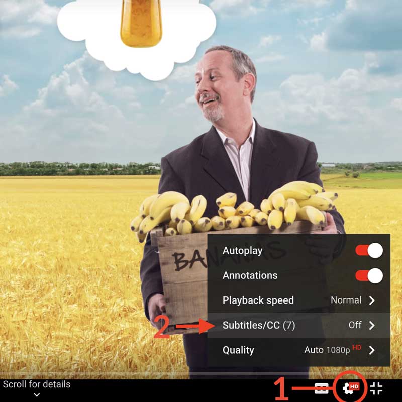
- Click the settings icon (⚙) at the bottom of the video screen.
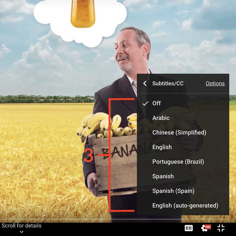
- Click Subtitles/CC.
- Select a language.
Contribute Translations!
Join the team and help us provide world-class economics education to everyone, everywhere for free! You can also reach out to us at [email protected] for more info.
Submit subtitles
Accessibility
We aim to make our content accessible to users around the world with varying needs and circumstances.
Currently we provide:
- A website built to the W3C Web Accessibility standards
- Subtitles and transcripts for our most popular content
- Video files for download
Are we missing something? Please let us know at [email protected]
Creative Commons

This work is licensed under a Creative Commons Attribution-NoDerivatives 4.0 International License.
The third party material as seen in this video is subject to third party copyright and is used here pursuant
to the fair use doctrine as stipulated in Section 107 of the Copyright Act. We grant no rights and make no
warranties with regard to the third party material depicted in the video and your use of this video may
require additional clearances and licenses. We advise consulting with clearance counsel before relying
on the fair use doctrine.