Graphing a Supply Curve from a Supply Schedule, and How to Read a Supply Graph
Course Outline
Graphing a Supply Curve from a Supply Schedule, and How to Read a Supply Graph
How do you graph a supply curve? Learn how to build and read supply curves on supply and demand graphs using real-world economics examples.
In this MRU video, we walk step-by-step through how to create a supply curve from a supply schedule and explain the two key ways economists read supply graphs.
You’ll learn:
- How to graph a supply curve from a supply schedule — data showing the quantity supplied at various prices
- Why supply curves slope upward
- How price affects quantity supplied
- The “horizontal method” for reading supply curves: the quantity supplied at a given price
- The “vertical method” for finding minimum acceptable prices at a given quantity
Using the market for oil as an example, we show how to convert a supply schedule into a graph and how to interpret what the graph means in practice.
Teacher Resources
Related to this course
See all Teacher Resources related to this course
Transcript
In this video, we're going to dive deeper into the supply curve by building one together and then learning two different ways to read a supply curve.
Let's start with a definition.
A supply curve is a function that shows the quantity supplied at different prices.
Now let's build a supply curve together using the market for oil as an example. Here's some hypothetical data that shows the quantity of oil supplied at different prices.
For example, at a price of $5 per barrel, the quantity of oil supplied would be 10 million barrels a day. At a higher price, say $20 per barrel, the quantity of oil supplied is going to be higher, 25 million barrels a day. And at an even higher price, say $55 per barrel, the quantity of oil supplied would be 50 million barrels a day.
Now let's convert these into a graph with the quantity of oil supplied on the horizontal axis and the price of oil on the vertical axis. We can now plot our three points and simply connect them with a line. That's the supply curve for oil. It shows us the quantity supplied at every price.
Notice that the supply curve for oil slopes upwards. That's because it costs more to produce more oil, so suppliers must be paid a higher price.
When the price of oil is low, only the least costly oil is profitable to produce. In order to get suppliers to be willing and able to produce more, the price has to rise so that it becomes profitable to extract oil from deeper wells or more difficult places in the world.
At a high market price, suppliers will pay the high cost to extract oil from the tar sands of Canada, for example, or to use deep water rigs in the depths of the ocean.
Now, let's discuss the two ways to read a supply curve.
We'll start with the horizontal method. To use the horizontal method, start with the price, say $55 per barrel, and read horizontally over to the supply curve and down to find that at that price, suppliers are willing and able to supply 50 million barrels of oil per day.
At a price of $20 per barrel, suppliers are willing and able to supply 25 million barrels of oil. And at a price of $5 per barrel, suppliers are willing and able to supply 10 million barrels of oil.
The second way of reading the supply curve, the vertical method, begins at the bottom and works its way up.
First, we pick a quantity along the horizontal axis, say 25 million barrels of oil. And we ask, what is the lowest amount that suppliers must be paid to produce that quantity?
To find the answer, we read up vertically to the supply curve and then over to find that suppliers must be paid at least $20 per barrel to produce 25 million barrels per day.
So how much must suppliers be paid to produce 50 million barrels of oil?
To produce 50 million barrels of oil per day, suppliers must be paid at least $55 per barrel.
Both ways of reading the supply curve are useful for solving different problems.
In general, the horizontal reading tells us the maximum quantity the suppliers are willing and able to sell at a given price. The vertical method tells us the minimum price at which suppliers will sell different quantities.
Demand and supply are at the heart of microeconomics, so make sure you practice reading these graphs.
If you're a teacher, you should check out our supply and demand unit plan that incorporates this video. If you're a learner, make sure this video sticks by answering a few quick practice questions. Or if you're ready for more microeconomics, click for the next video.
Subtitles
- English
- Spanish
- Chinese
- Hindi
- French
- Arabic
Thanks to our awesome community of subtitle contributors, individual videos in this course might have additional languages. More info below on how to see which languages are available (and how to contribute more!).
How to turn on captions and select a language:
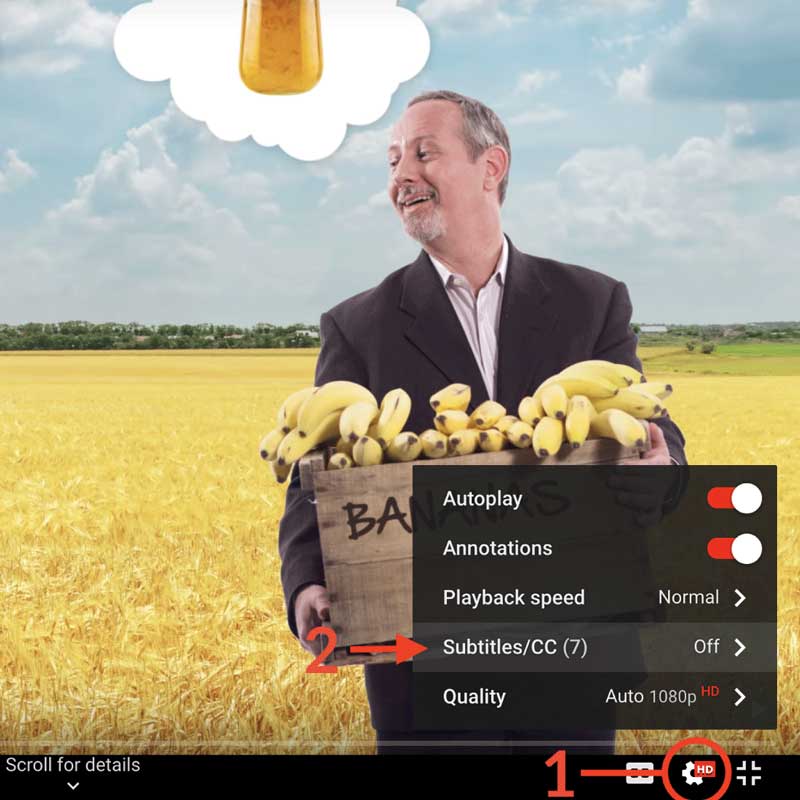
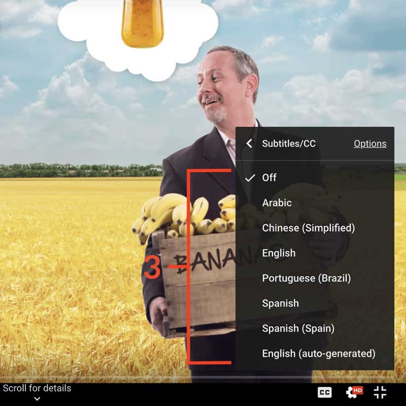
- Click the settings icon (⚙) at the bottom of the video screen.
- Click Subtitles/CC.
- Select a language.
Contribute Translations!
Join the team and help us provide world-class economics education to everyone, everywhere for free! You can also reach out to us at [email protected] for more info.
Submit subtitles
Accessibility
We aim to make our content accessible to users around the world with varying needs and circumstances.
Currently we provide:
- A website built to the W3C Web Accessibility standards
- Subtitles and transcripts for our most popular content
- Video files for download
Are we missing something? Please let us know at [email protected]
Creative Commons

This work is licensed under a Creative Commons Attribution-NoDerivatives 4.0 International License.
The third party material as seen in this video is subject to third party copyright and is used here pursuant
to the fair use doctrine as stipulated in Section 107 of the Copyright Act. We grant no rights and make no
warranties with regard to the third party material depicted in the video and your use of this video may
require additional clearances and licenses. We advise consulting with clearance counsel before relying
on the fair use doctrine.