Linear Regression
Course Outline
Linear Regression
This is "Intro to Linear Regression" from our Understanding Data course.
What happens to course evaluations when a professor is really, really good looking?
Are the evaluations more favorable? And if so, how big is the difference when compared to a not-so-attractive professor?
Linear regression is a neat little tool that can help us figure this out. (Don’t worry – it’s not nearly as complicated as it sounds.) And, given that student evaluations can help determine a professor’s pay, this exercise has important real-world implications.
How do we go about testing whether looks have an impact on course evaluations? If we take two professors – one who’s unattractive and one who’s gorgeous – we can start our test. We’ll need two variables for each professor: an average “beauty score” and average evaluation score.
Using a scatterplot, we can draw a straight line through the data points (our linear regression) to visualize the relationship between our two variables.
In this video, we use data from a real study to examine this relationship. So how closely correlated are these two variables? You’ll have to watch to find out!
Teacher Resources
Transcript
Hi! In the upcoming series of videos, we're going to give you a shiny new tool to put into your Understanding Data toolbox: linear regression.
Say you've got this theory. You've witnessed how good-looking people seem to get special perks. You're wondering, "Where else might we see this phenomenon?" What about for professors? Is it possible good-looking professors might get special perks too? Is it possible students treat them better by showering them with better student evaluations? If so, is the effect of looks on evaluations really big or really small? And say there is a new professor starting at a university.
- [Lloyd Christmas] G'day, mate.
What can we predict about his evaluation simply by his looks? Given that these evaluations can determine pay raises, if this theory were true, we might see professors resort to some surprising tactics to boost their scores.
- [Lloyd Christmas] Yeah!
Suppose you wanted to find out if evaluations really improve with better looks. How would you go about testing this hypothesis? You could collect data. First you would have students rate on a scale from 1 to 10 how good-looking a professor was, which gives you an average beauty score. Then you could retrieve the teacher's teaching evaluations from twenty-five students. Let's look at these two variables at the same time by using a scatterplot.
We'll put beauty on the horizontal axis, and teacher evaluations on the vertical axis. For example, this dot represents Professor Peate—[Bib Fortuna] De wana wanga.—who received a beauty score of 3 and an evaluation of 8.425. This one way out here is Professor Helmchen—[Ben Stiller, "Zoolander"] Ridiculously good-looking!—who got a very high beauty score, but not such a good evaluation. Can you see a trend? As we move from left to right on the horizontal axis, from the ugly to the gorgeous, we see a trend upwards in evaluation scores.
By the way, the data we're exploring in this series is not made up—it comes from a real study done at the University of Texas. If you're wondering, "pulchritude" is just the fancy academic way of saying beauty. With scatterplots, it can sometimes be hard to make out the exact relationship between two variables—especially when the values bounce around quite a bit as we go from left to right. One way to cut through this bounciness is to draw a straight line through the data cloud in such a way that this line summarizes the data as closely as possible. The technical term for this is "linear regression." Later on we'll talk about how this line is created, but for now we can assume that the line fits the data as closely as possible.
So, what can this line tell us? First, we immediately see if the line is sloping upward or downward. In our data set we see the fitted line slopes upward. It thus confirms what we have conjectured earlier by just looking at the scatterplot. The upward slope means that there is a positive association between looks and evaluation scores. In other words, on average, better-looking professors are getting better evaluations.
For other data sets, we might see a stronger positive association. Or, you might see a negative association. Or perhaps no association at all. And our lines don't have to be straight. They can curve to fit the data when necessary. This line also gives us a way to predict outcomes. We can simply take a beauty score and read off the line what the predicted evaluation score would be.
So, back to our new professor.
[Lloyd] Look familiar?
We can precisely predict his evaluation score. "But wait! Wait!" you might say. "Can we trust this prediction?" How well does this one beauty variable really predict evaluations? Linear regression gives us some useful measures to answer those questions, which we'll cover in a future video. We also have to be aware of other pitfalls before we draw any definite conclusions.
You could imagine a scenario where what is driving the association we see is really a third variable that we have left out. For example, the difficulty of the course might be behind the positive association between beauty ratings and evaluation scores. Easy intro courses get good evaluations. Harder, more advanced courses get bad evaluations. And younger professors might get assigned to intro courses. Then, if students judge younger professors more attractive, you will find a positive association between beauty ratings and evaluation scores. But it's really the difficulty of the course, the variable that we've left out—not beauty—that is driving evaluation scores. In that case, all the primping would be for naught—a case of mistaken correlation for causation—[Lloyd] Wait a minute—something we'll talk about further in a later video.
And what if there were other important variables that affect both beauty ratings and evaluation scores? You might want to add considerations like skill, race, sex, and whether English is the teacher's native language to isolate more cleanly the effect of beauty on evaluations. When we get into multiple regression, we will be able to measure the impact of beauty on teacher evaluations while accounting for other variables that might confound this association. Next up, we'll get our hands dirty by playing with this data to gain a better understanding of what this line can tell us.
Subtitles
Thanks to our awesome community of subtitle contributors, individual videos in this course might have additional languages. More info below on how to see which languages are available (and how to contribute more!).
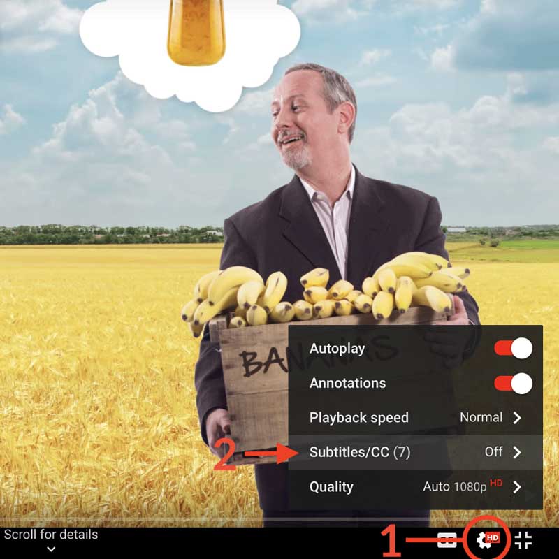
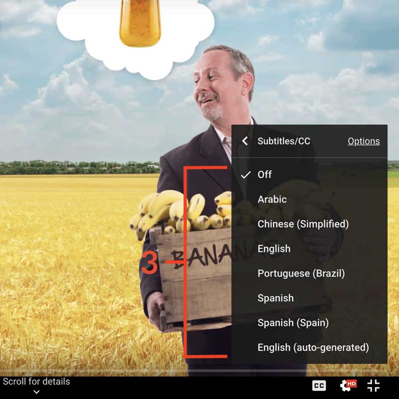
How to turn on captions and select a language:
- Click the settings icon (⚙) at the bottom of the video screen.
- Click Subtitles/CC.
- Select a language.


Contribute Translations!
Join the team and help us provide world-class economics education to everyone, everywhere for free! You can also reach out to us at [email protected] for more info.
Submit subtitles
Accessibility
We aim to make our content accessible to users around the world with varying needs and circumstances.
Currently we provide:
- A website built to the W3C Web Accessibility standards
- Subtitles and transcripts for our most popular content
- Video files for download
Are we missing something? Please let us know at [email protected]
Creative Commons

This work is licensed under a Creative Commons Attribution-NoDerivatives 4.0 International License.
The third party material as seen in this video is subject to third party copyright and is used here pursuant
to the fair use doctrine as stipulated in Section 107 of the Copyright Act. We grant no rights and make no
warranties with regard to the third party material depicted in the video and your use of this video may
require additional clearances and licenses. We advise consulting with clearance counsel before relying
on the fair use doctrine.

